

Graphing IEP data turns a page of numbers into a picture anyone can read in seconds. Picture an IEP meeting where a parent is handed a table of scores from six months of reading probes. The numbers are accurate, yet no one at the table can say quickly whether the student is on track. A simple monthly graph would answer that question before anyone asks it.
This guide gives you a five-step method: choose and convert the data, set up the graph, plot one point each month, read the trend, and share the graph to guide decisions. By the end, you will be able to build a clear monthly graph for any measurable IEP goal.
Examples are fictional. Adapt to the student’s goals and agreed supports. This is guidance, not a diagnosis.
At a glance
- Graph one measurable goal at a time, using the same measure every month.
- Converting scores to percent toward proficiency puts every goal on the same 0 to 100 scale.
- A monthly bar graph from August to May shows growth and stalls at a glance.
- Read the trend over several months, not a single bar.
- Bring the graph to meetings so the whole team can see the same picture.
1. Choose and convert the data for graphing IEP data
First, pick the goal you want to graph. Graphing IEP data works best when the goal is measurable, such as words read correctly per minute, percent of steps completed, or number of correct math facts. If the goal is vague, the graph will be vague too. In that case, talk with the IEP team about how the goal is measured before you start graphing IEP data for it.
Next, decide how you will measure the goal each month. Use the same task, the same conditions, and roughly the same day of the month. For example, a one-minute reading probe at the same level, given in the first week of each month, keeps the data comparable.
Then, convert each score to percent toward proficiency. This means dividing the student’s score by the goal target and multiplying by 100. When every goal uses the same 0 to 100 scale, graphs are easier to read and compare.
| Goal target | Student score | Percent toward proficiency |
|---|---|---|
| 100 words per minute | 60 words | 60% |
| 20 math facts | 15 facts | 75% |
| 10 routine steps | 4 steps | 40% |
| 80% accuracy | 40% accuracy | 50% |
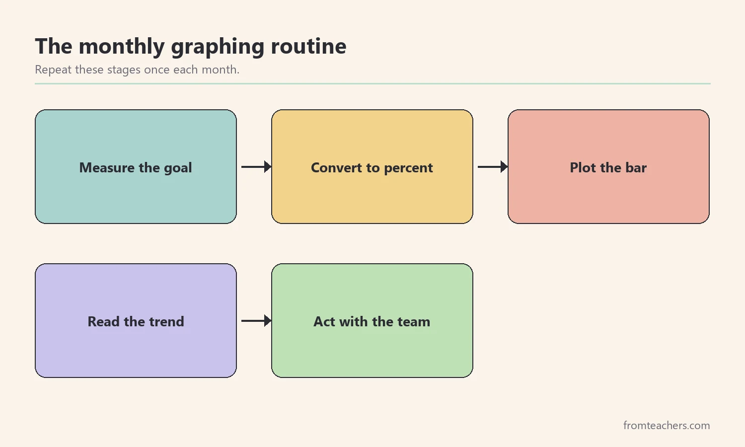
Worked example. Nora is a fictional student in grade 4. Her IEP reading goal is to read 100 words correctly per minute on a grade-level passage by May. In September, she reads 60 words correctly per minute. Her teacher records 60 out of 100, which is 60% toward proficiency.
In short, the conversion is simple arithmetic. As a result, graphing IEP data becomes consistent across goals and students.
2. Set up the graph before the year starts
Once you know the measure, set up the graph. A clear layout makes graphing IEP data quick each month and easy for others to read. Most monthly graphs need only a few parts.
Start with the header. Write the student’s name, grade, and the exact goal or objective. Then, set the y-axis from 0% to 100% percent toward proficiency, and the x-axis with months from August to May. Leave one column for each month.
Graph setup checklist
- Student name, grade, and the full goal written in the header.
- Y-axis from 0% to 100%, marked in steps of 10.
- X-axis with one column per month, August to May.
- A note on how and when the goal is measured.
- A simple key if you use colors for different meanings.
Also, consider marking the goal level. Since the target is 100% toward proficiency, the top of the graph is the finish line. Many teachers who start graphing IEP data also draw a light line from the starting bar to 100% in May. This aim line shows where the student would need to be each month to reach the goal on time.
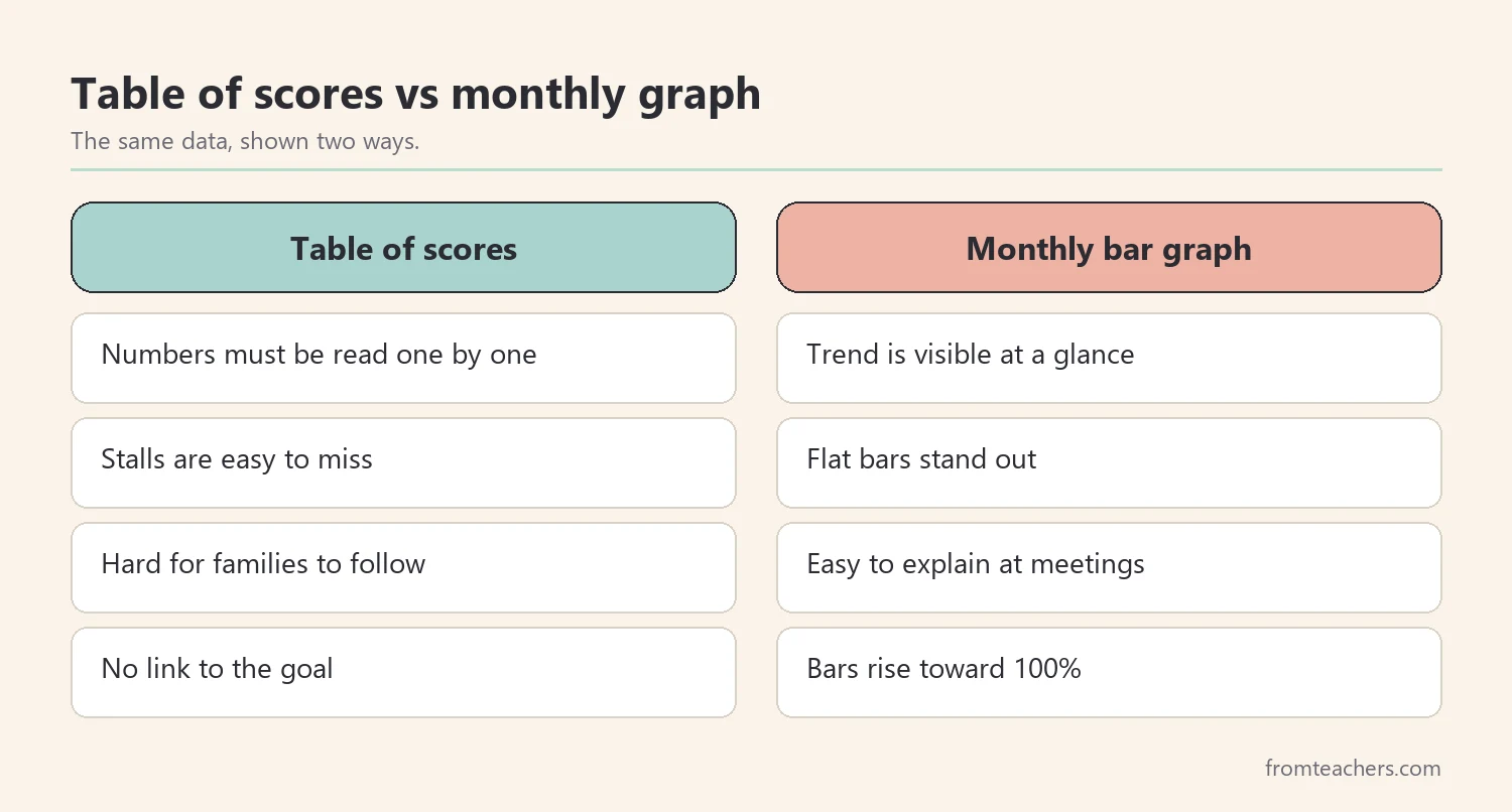
Worked example. Nora’s teacher prepares one graph sheet for her reading goal. She writes the goal in the header, labels August to May along the bottom, and draws a light aim line from 60% in September to 100% in May. She files the sheet in Nora’s data binder.
Finally, keep one graph per goal. Mixing goals on one graph makes the picture harder to read. When graphing IEP data for a student with three goals, simply prepare three sheets and keep them together in the same binder.
3. Plot one bar each month for graphing IEP data
Next, collect the data on your planned day and plot it right away. Graphing IEP data on the same day keeps the record current and avoids a stack of numbers waiting at the end of the term.
For each month, color a bar from 0% up to the student’s percent toward proficiency. Write the exact number at the top of the bar. In addition, note anything unusual below the month, such as an absence, a new support, or a schedule change.
Then, use color with purpose. For example, one color for regular months and a second color for months after a new support was added. A small key on the sheet explains what each color means, so no one has to guess.
If you want a ready-made layout, the IEP Objective Monitoring graphing sheets include blank August-to-May grids with a percent toward proficiency scale, plus a filled-in example of a reading fluency goal.
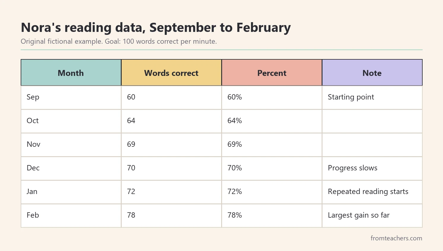
Worked example. Nora’s teacher gives the reading probe in the first week of each month. From September to February, Nora reads 60, 64, 69, 70, 72, and 78 words correctly per minute. Because the target is 100 words, each score is also her percent toward proficiency. In January, her teacher adds a note: “New repeated reading routine starts.”
In other words, each bar takes about a minute to plot. Over a year, those minutes become a clear story. Graphing IEP data in small monthly steps is far easier than rebuilding a whole year of scores the week before a meeting.
4. Read the trend when graphing IEP data
A graph is only useful if you read it. Look at several bars together, not just the newest one. The main question is simple: is the student moving toward the goal fast enough to reach it on time?
Start by comparing the bars with the aim line. If most bars are near or above it, the student is on track. If several bars in a row sit below it, progress may be too slow. In addition, look for flat stretches, where bars stay about the same for two or more months.
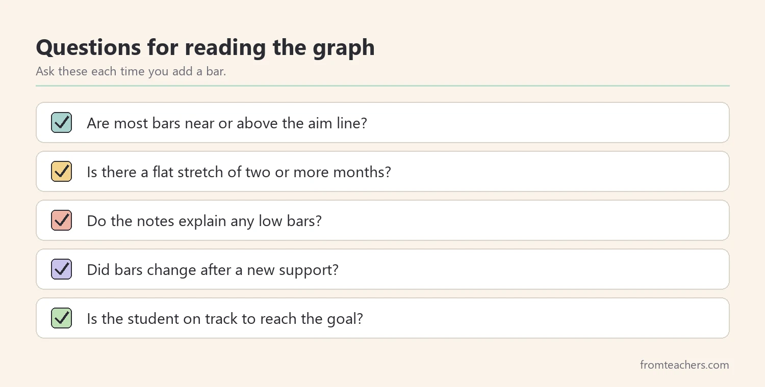
Next, check the notes under each month. A dip after a long absence means something different from a dip during a normal month. Notes help the team avoid reading too much into one bar. In fact, careful notes are what make graphing IEP data trustworthy when the team has to decide whether to change a plan.
| What the graph shows | What it may mean |
|---|---|
| Steady rise near the aim line | Current plan is working |
| Flat for two or more months | Time to review supports |
| One low bar with a note | Likely a one-off, keep watching |
| Rising faster than the aim line | Goal may need to be raised |
Worked example. Nora’s graph rises from 60% to 69% between September and November. Then it flattens: 70% in December and 72% in January. Her aim line climbs 5 points a month, from 60% in September to 100% in May, so it sits at 80% in January. She is below it. After the new repeated reading routine starts in January, her February bar rises to 78%. That 6-point gain is her largest so far, although she is still below the February aim of 85%.
As a result, the team can see both the stall and the response to a change on one page. Graphing IEP data this way also shows that one good month is not the finish line, so the team keeps watching.
5. Share the graph and act on your IEP data
Graphing IEP data matters most when the graph changes what happens next. Therefore, bring the graph to IEP meetings, progress report conversations, and team check-ins. A single page helps parents, teachers, and specialists see the same picture.
When you share, start with the goal and the starting point. Then, point to the trend, any stalls, and any changes you made. Keep the language plain, because graphing IEP data is meant to make progress clearer for everyone, not only for specialists. For example, say “Nora’s reading grew from 60 to 78 words per minute, with a flat stretch in December and January,” instead of using technical terms.
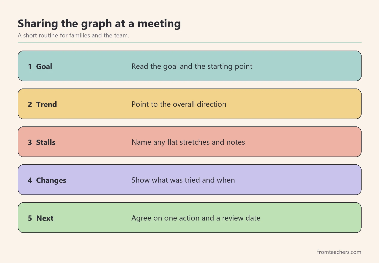
Next, agree on one action. If progress is steady, keep the plan. When the graph has stalled, discuss one change to instruction or support. If the student is moving well ahead, the team may consider whether the goal should be updated. These decisions belong to the IEP team.
Finally, keep the graph going. A graph started in September and kept through May tells the full story of the year, and it gives next year’s team a clear starting point.
Worked example. At Nora’s February check-in, her teacher shares the graph with her parents and the reading specialist. Her parents notice the January rise matches when Nora started rereading library books at home. The team agrees to keep the repeated reading routine and review the graph again in April.
Common mistakes and how to avoid them
- Changing the measure partway through. Bars stop being comparable. Fix: use the same task and conditions every month.
- Graphing several goals on one sheet. The picture becomes cluttered. Fix: keep one graph per goal.
- Reacting to a single bar. One low month may have a simple explanation. Fix: look at the trend across several months and read the notes.
- Waiting until the end of the term. Stalls are found too late to act. Fix: plot the bar on the day you collect the data.
- Leaving out notes. No one remembers why a bar was low. Fix: write a short note under any unusual month.
Questions teachers and parents ask about graphing IEP data
Why use percent toward proficiency instead of raw scores?
Percent toward proficiency puts every goal on the same 0 to 100 scale. That makes graphs easier to read and compare, especially when a student has several goals with different measures. You can still write the raw score on each bar.
How often should I collect data for graphing IEP data?
A monthly point works well for a simple overview graph. Some goals and teams collect data more often, and that is fine. Follow the schedule written in the student’s IEP.
Is a bar graph better than a line graph?
Both can work. A bar graph with one bar per month is easy for families to read and quick to color by hand. A line graph can show trends clearly when there are many data points.
What should I do when the graph stalls?
First, check the notes for absences or changes. If the stall is real and lasts two or more months, bring the graph to the team and discuss one change to instruction or support. Then, keep graphing to see whether the change helps.
Can students help with graphing IEP data?
Yes, many students enjoy coloring their own bars. Seeing their growth can be motivating. Keep the conversation positive and focus on effort and progress.
Related reading: The Power of Data Tracking in Special Education, Special Education Accommodation and Modification Tracker, and How Parents and Teachers Can Team Up for Special Education Success.
A companion resource for graphing IEP data:
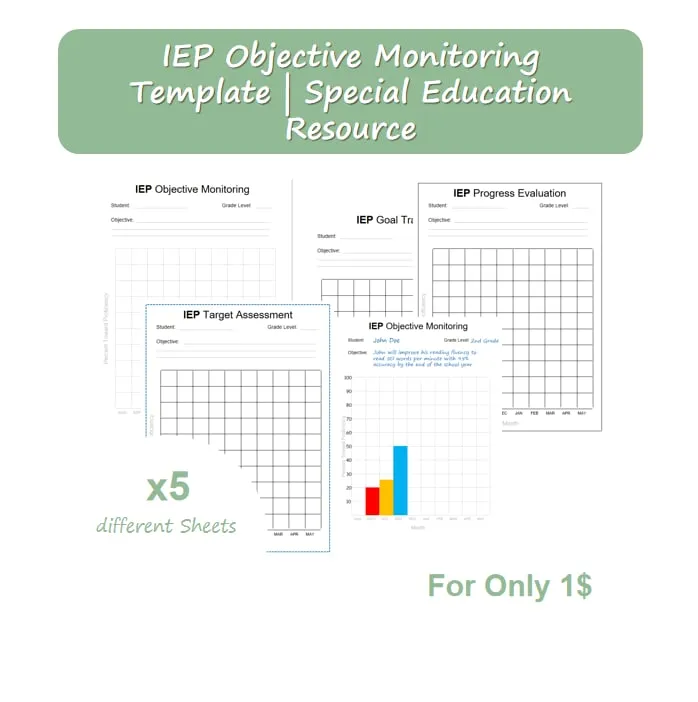
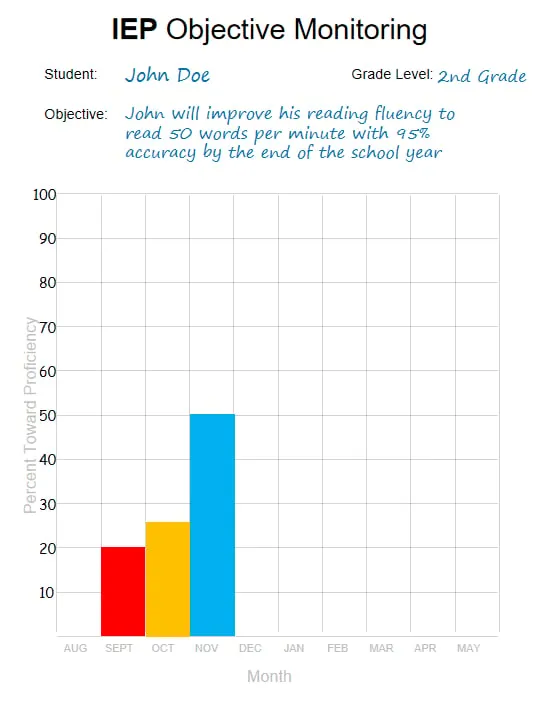
IEP Objective Monitoring: 5 Graphing Sheets: blank bar-graph sheets with a student, grade, and objective header, an August-to-May grid, and a 0 to 100% percent toward proficiency scale, plus one filled-in reading fluency example.
Sources and scope
- IRIS Center, Vanderbilt University: free modules on progress monitoring and data-based decisions.
- National Center on Intensive Intervention: resources on progress monitoring and using data to adjust instruction.
- Center for Parent Information and Resources: information for families on IEPs and progress reporting.
- IDEA, U.S. Department of Education: the law behind IEPs, including reporting progress toward goals.
This guide covers a simple monthly method for graphing progress on measurable IEP goals. It does not cover formal assessment selection, statistical analysis, or legal reporting requirements, which follow your district’s policies and the IEP team’s decisions.
Key takeaways
- Graphing IEP data starts with one measurable goal and a consistent monthly measure.
- Convert scores to percent toward proficiency for a shared 0 to 100 scale.
- Plot one bar each month and add short notes for unusual months.
- Read the trend against an aim line, not a single bar.
- Share the graph with the team and agree on one next step.










Leave a Comment