
Classroom wall display mistakes are easy to miss because we stop seeing our own walls after the first week. Picture Ms. Ortiz’s grade 10 English room in October. Every wall is covered: novel posters, grammar rules, last year’s projects, a calendar, school notices and a string of lights. Sam, an autistic student in her third period, keeps his hood up and his eyes on his desk.
This list is for middle and high school teachers who want walls that help teenagers think rather than compete for their attention. It covers eight common mistakes, ordered by where they show up as you walk from the front of the room to the back. For each, you will find why it matters, a simple fix and how it played out in Ms. Ortiz’s room.
Examples are fictional. Adapt to the student’s goals and agreed supports. This is guidance, not a diagnosis.
At a glance
- Walls should support learning, not decorate every inch.
- The front wall matters most, so keep it the calmest.
- Display what students use now, and retire the rest.
- Teens notice tone: displays can include or exclude.
- Audit the room once a term with students’ help.
How this list is ordered
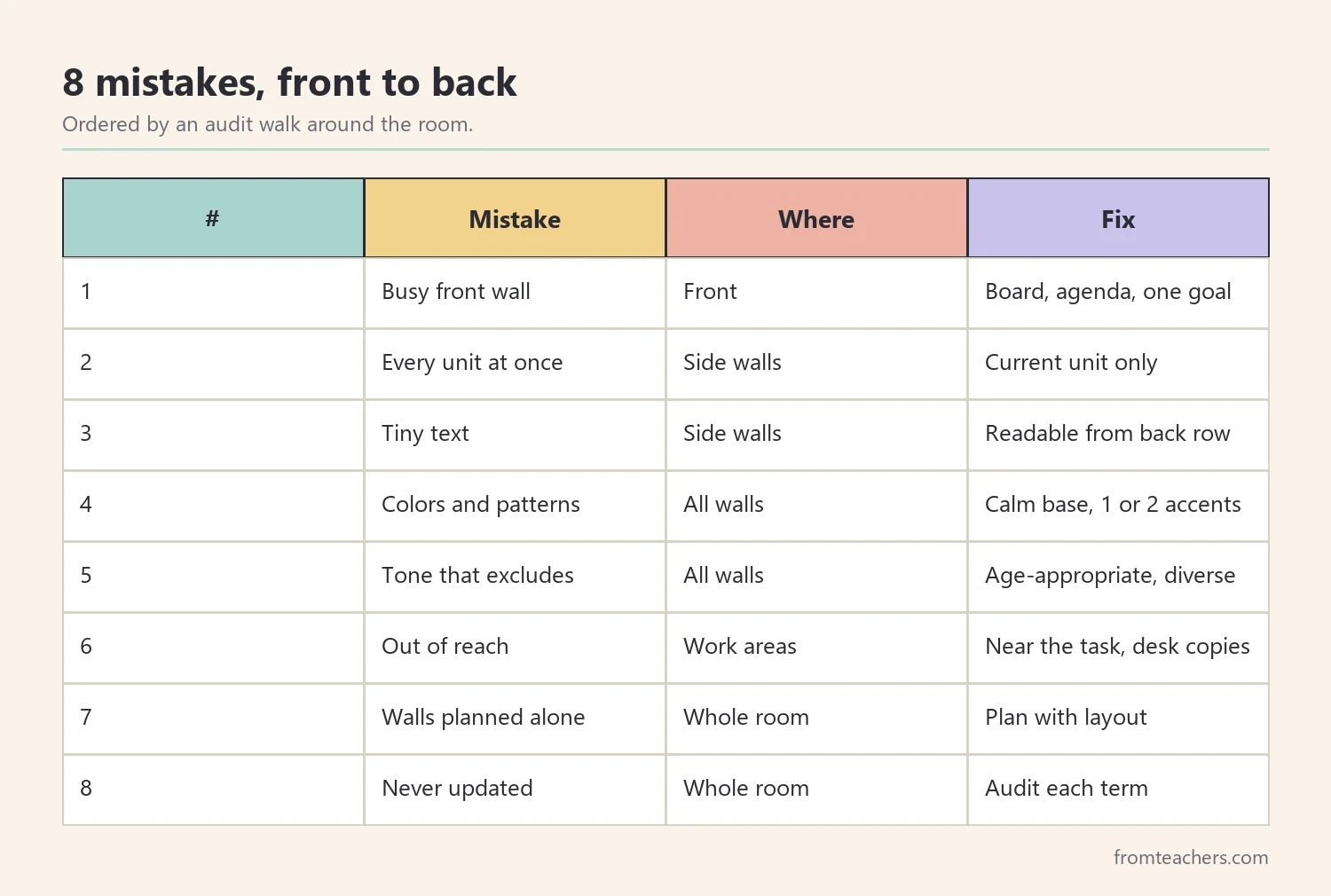
We did not rank these mistakes by how harmful they are, because each room and each group of students is different. Instead, the list follows a walk around the room: front wall first, then side walls, then the back and the details. Therefore, you can use it as a quick audit route after school.
The ideas connect to Universal Design for Learning, which encourages teachers to reduce unnecessary barriers and distractions so more students can access learning. Figure 1 shows the full route.
1. Covering the front wall
The first of the classroom wall display mistakes is also the most common: filling the wall that students look at all lesson. The front wall sits behind you, the board and the screen, so everything on it competes with your teaching.
Why it matters: students who are easily distracted, or who process a lot of visual information, may find it harder to focus on what matters right now.
The fix: keep the front wall nearly empty. Leave the board, the screen, the day’s agenda and perhaps one learning goal. Move everything else to the sides or the back.
Example: Ms. Ortiz took down eleven items from her front wall and kept three. Sam pushed his hood back during the second week, and she noticed he looked up at the board more often.
2. Displaying everything at once
Next, many rooms show every unit of the year at the same time. Grammar rules from September sit beside poetry terms from spring. Over time, the walls become a visual archive.
Why it matters: when everything is displayed, nothing stands out. Students cannot tell which information is useful today.
The fix: display what students use in the current unit. Store the rest in a binder, a shared slide deck or a labeled folder that students can consult when needed.
Example: Ms. Ortiz moved old unit posters into a “reference binder” by the door. Students asked for it a few times a week, which showed what was truly useful.
3. Using text that is too small to read
Many commercial posters carry paragraphs of tiny text. From a desk at the back of the room, they become gray blocks.
Why it matters: a display that cannot be read from a seat is decoration, not support. It adds visual noise without adding access.
The fix: sit at the farthest desk and check what you can read. Keep only displays with large, clear text and short phrases. If a poster has useful content in small print, put a copy in the reference binder instead.
Example: From the back row, Ms. Ortiz could read only two of her nine side-wall posters. She remade the most useful one with five large words.
4. Mixing bright colors and patterns everywhere
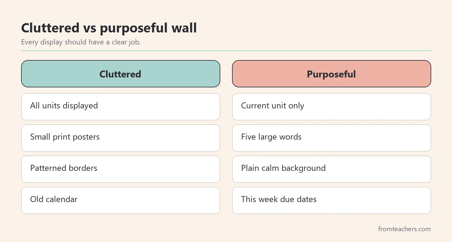
Bright borders, patterned backgrounds and many colors can make a room feel lively. However, together they add a lot of visual activity, especially for students with sensory sensitivities.
Why it matters: busy patterns can make it harder to find the information that matters. Some students also find them tiring over a long day.
The fix: choose a calm, neutral background for boards and one or two accent colors. Use color with purpose, for instance one color per unit or per type of information.
Example: Ms. Ortiz replaced patterned borders with plain cream paper. She used blue only for “how to” displays, so students learned to look for blue when they were stuck.
5. Forgetting that teens read the tone of the room
Teenagers are quick to notice who is shown on the walls and how. Childish clip art, jokes at students’ expense or displays that only reflect some students can quietly signal who belongs.
Why it matters: a sense of belonging affects how students take part in class. Walls are part of that message.
The fix: choose age-appropriate visuals and show a range of authors, people and student voices. Ask students what they would like to see. In addition, avoid public displays of grades or behavior charts.
Example: Ms. Ortiz invited each class to add one favorite quote from a book they chose. Students who rarely spoke in discussions added quotes and pointed them out to friends.
6. Placing displays where students cannot use them
A writing checklist is only useful if a student can see or reach it while writing. Many helpful displays end up above eye level or behind furniture.
Why it matters: support that is hard to reach often goes unused, especially by students who are reluctant to stand up or ask.
The fix: place working displays near the place where students do the task. Also offer desk-size copies, so a student can keep a checklist in front of them without moving.
Example: Ms. Ortiz printed small versions of her essay checklist for each table group. Sam kept one in his folder and used it without asking.
7. Treating walls as separate from the whole room design
Displays do not work alone. Lighting, seating, movement paths and quiet spaces all shape how a room feels. A calm wall next to a crowded walkway still leads to a busy room.
Why it matters: inclusive design looks at the whole space. Fixing one wall helps, but planning the room as a system helps more.
The fix: look at walls together with layout, seating and movement. A ready-made inclusive classroom design guide with UDL and flexible seating can help here: its 53 comic-style pages cover physical space and layout, visual environment and displays, flexible seating, UDL and classroom culture, with before and after comparisons.
Example: After reading about layout, Ms. Ortiz moved her reference binder away from the doorway, where students crowded at the start of class.
8. Never revisiting the walls
Finally, the quietest of the classroom wall display mistakes: setting up the room in August and never looking again. Displays fade, curl and lose meaning by spring.
Why it matters: outdated walls tell students the space is not really for them right now.
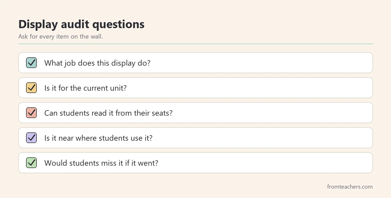
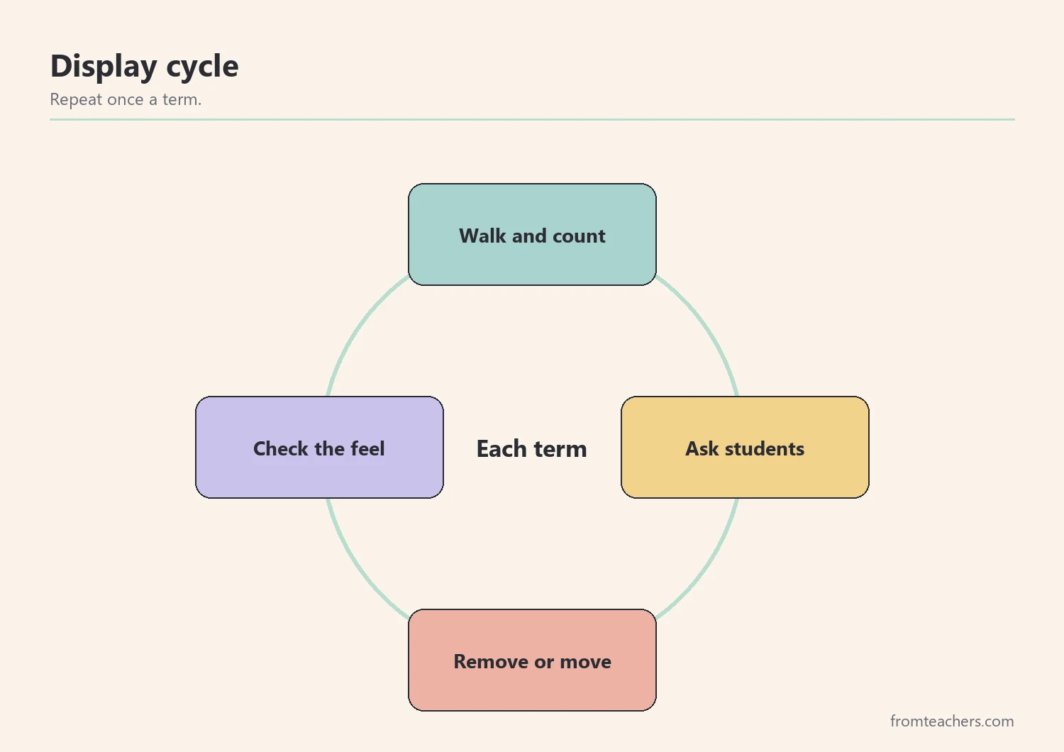
The fix: audit the room once a term. Ask a few students to walk around and name what they use, what they never look at and what they would change. Then act on one or two ideas.
Example: Ms. Ortiz’s students said they never looked at the calendar but often wanted the week’s due dates. She replaced the calendar with a simple “this week” board.
A simple display audit, with numbers
Counting can make the change easier to see. Ms. Ortiz counted her displays before and after the makeover, wall by wall, and asked students to rate how calm the room felt on a scale of 1 to 5.
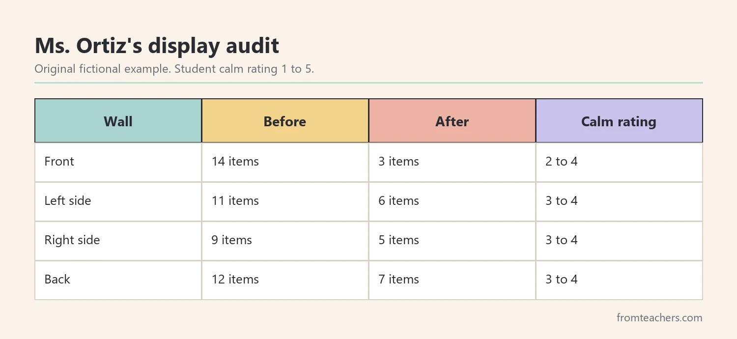
The room still had plenty to look at. However, every remaining display had a clear job. Consequently, the walls became tools rather than background. Figure 4 lists questions for your own audit, and Figure 5 shows the cycle she now repeats each term.
Working with students who have sensory needs
Some students are especially sensitive to visual input. If a student has a sensory plan, IEP or 504 plan, check what it says about the environment and talk with the support team. Small changes, such as seating facing a calmer wall, may already be agreed.
Also, remember that calm does not mean empty or cold. A thoughtful room can still feel warm, personal and full of student work. The goal is to choose, not to strip everything away. Student work, a few plants or a reading corner can all stay when they have a place and a purpose.
Common mistakes and how to avoid them
- Removing everything at once. Fix: change one wall at a time and ask students how it feels.
- Buying new decor to fix clutter. Fix: start by removing and reorganizing what you have.
- Ignoring the hallway view. Fix: check what students see when they enter.
- Making displays only for visitors. Fix: design for the students who sit there every day.
- Forgetting school rules. Fix: check fire safety and display policies before hanging anything near doors or ceilings.
Questions teachers ask about classroom wall display mistakes
How much should be on the walls?
There is no exact number. A practical rule is that every display should have a clear job and be readable from student seats. If you cannot name its job, store it.
Are bare walls better for autistic students?
Not necessarily. Many autistic students benefit from a calmer room, but needs differ. Ask the student and the support team, and avoid assuming one setup fits everyone.
Does this apply to elementary classrooms too?
The same principles apply, though younger students may use more visual supports. This list focuses on secondary rooms, where content is denser and teens notice tone quickly.
What if I share my room with other teachers?
Agree on a shared front wall and divide side walls by subject. A short conversation at the start of the term avoids clutter building up from several sources.
How do students react to fewer displays?
Reactions vary. Some notice right away; others say nothing. Asking them in a quick survey often shows which changes they value.
Related reading: Managing Sensory Overload: Practical Strategies for Autism and ADHD, 5 Practical Teaching Tips to Boost Classroom Focus, and Learning Styles Student Success Guide.
You may also need: Sensory Processing Disorder (SPD) Guide: Strategies for Parents and Teachers.
A companion resource for classroom wall display mistakes:
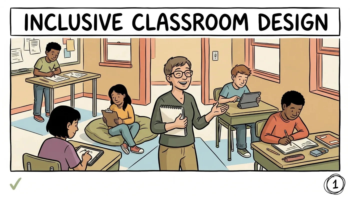
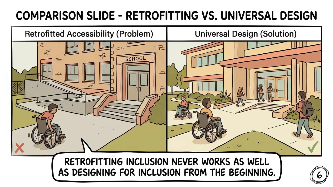
Inclusive Classroom Design Guide: UDL & Flexible Seating: a 53-page comic-style digital guide covering what inclusion means, physical space and layout, visual environment and displays, flexible seating and movement, Universal Design for Learning and building belonging, with before and after comparisons.
Sources and scope
- CAST UDL Guidelines: the Universal Design for Learning framework, including options for perception and minimizing distractions.
- CAST: resources on designing learning environments that work for more students.
- Understood.org: practical articles for teachers on attention, sensory needs and classroom setup.
- ADA.gov: official information about accessibility under the Americans with Disabilities Act.
This guide covers everyday choices about wall displays in middle and high school classrooms. It does not cover building accessibility requirements, fire codes or individual sensory plans, which follow school policy and the student’s support team.
Key takeaways
- Most classroom wall display mistakes come from showing too much at once.
- Keep the front wall calm and display only current, useful content.
- Check readability from the back row and place supports where students work.
- Choose age-appropriate, inclusive visuals for teens.
- Audit the walls each term with student input.








Leave a Comment